


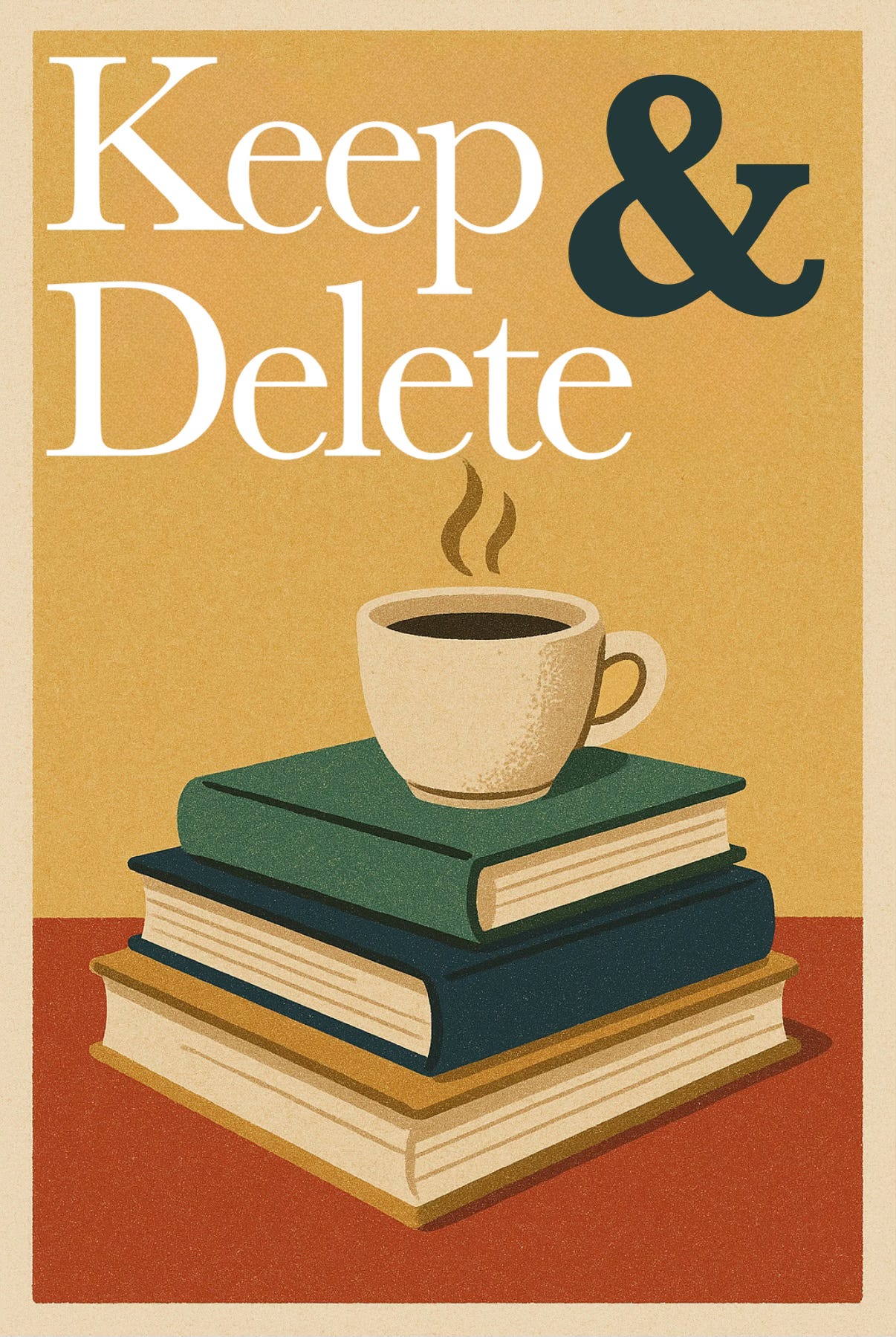
Keep
I love Substack so much. So much, in fact, that I have stopped posting to our blog PJandThomas.com entirely and have devoted all of my time to this newsletter. That’s why it’s so exciting when Substack releases new ways to customize your publication! They went years without releasing too many updates to change the look of your newsletter (fonts, colors, layouts, etc.), but lately, they’ve been rolling out updates left and right and it’s been so fun to play around with! Case in point: new fonts! If you’re reading this on a mobile website or a desktop, the titles of our posts and the body of them are different! If you’re reading it in your email, they probably look the same. I wish Substack would let us customize the way our newsletters look when they get delivered to your inbox, but right now they only let us change the way they look on the website. I love switching things up from time to time to keep things fresh and fun. So for now, we’re sticking with serif fonts for both the title and body of the newsletter. Thoughts?
Delete
And after all that, I’m still not 100% sure if I like the new fonts or not, haha. We’ll keep them around for a bit and see. They got rid of the old fonts I used for Okay McKay, so I can’t go back to them anyway, so we’re stuck with them for now!
What’s your Keep & Delete for today?
I usually read from my email, but I had to come to the app to see. Truthfully, I don’t really notice the font much, I’m usually focused on your writing. 💙
I read from the Substack app on an iPhone. Everything looks good to me. 🤗❤️